Developer Support
UI/UX Guidelines
11 min read
·
Last updated on Aug 25, 2021
In this guide, we’ll go over a few general guidelines and best practices to follow in your app components, so that your app will be easy to use and feel native to the Wix platform.
Note:
Before you dive into our guidelines, get a general idea of how users will add and use your app.
Getting familiar with this basic user flow will help you design an app that integrates seamlessly with our platform.
Getting familiar with this basic user flow will help you design an app that integrates seamlessly with our platform.
Flow
- Prepare for all the realistic flows of a user using the app. This means making sure all scenarios are included (empty state, error messages, populated) and not only the standard flow.
- Make sure to display the correct component states for each scenario: hover, click, drag, disabled, on/off, etc.
Layout
The layout of your app determines how users see information and how they navigate it. That’s why the layout hierarchy should be based on your app's content.
- Evaluate your content and it’s position in the app. Think of what actions a user should complete first, and what information they will need in order to do so. Then arrange and group the actions and information so that the most important things are seen first.
- Keep the fold in mind. Display important information above the fold; everything that’s put under it won’t be seen until the user scrolls down. For full-screen components, remember that Wix's fold is 650px.
- Once you have organized the content and its hierarchy, ensure that the composition you’re using is consistent throughout the app.
Grid and Composition
A grid is a structure that consists of vertical and/or horizontal lines that form columns or modules. This structure defines spacing and the size of elements placed in it.

Composition is the way in which components are positioned on the grid, according to grid rules. 
- Make sure your pages follow a consistent grid. Check for consistency in spacing and margins throughout the app.
- Remember that element grouping (how close or far elements are spaced from each other) affects UX. If certain elements are placed together with small spacing, they appear as a group of related elements. And if elements are placed further apart, they appear to be separate. See which elements can be grouped and where they should be placed according to hierarchy.
- Composition may vary from page to page depending on different content, but it should still respect the grid rules.
Consistency and Hierarchy
- Keep element alignment consistent throughout the app. There can be different alignment types chosen for particular element groups (cards, card content, popup content, titles, text, etc.), but each group's alignment should remain consistent.
- If your app has multiple calls to action (CTAs), the most important actions should be the most visible, followed by secondary actions, etc. Don't confuse the user by adding a lot of CTAs of the same importance on one page.

Navigation
Structure
- Think about what your users will want to do when they open your app, and the steps you want to expose to them first.
- Pay attention to different scenarios (e.g., first time use, second time, trying to change settings…) and ensure your navigation helps users to reach their goals in each of these cases.
- Organize information in the menu clearly, and arrange it based on the level of importance to the user.
- Look through the structure of your menu and see if any of the sections can be changed, reorganized or merged.
Tip:
Write down everything that will be offered in the menu in a list. Once you have a complete list, arrange each option based on hierarchy and similarity of function.
- Make sure the menu page titles reflect the contents of each page.
- Try to avoid deep navigation structures. The ideal depth will depend on the product and content complexity, but be sure to check carefully if the depth makes sense and if there are clear indications.
- Avoid dead ends. There should always be the navigation option to go back if needed.
Indication
- Make the navigation menu or elements visible in all cases where user needs them (e.g., during onboarding, users should see only the steps for onboarding, and when they finish they should see the menu and pages where they can navigate).
- Always indicate where the user is. You can do this by highlighting a selected menu item, adding breadcrumbs, and/or including page titles.
Consistency
- Make sure the menu items are visually consistent. Selected menu items should have one distinctive state, deeper pages should have a visual separation (indented list items).

Readability
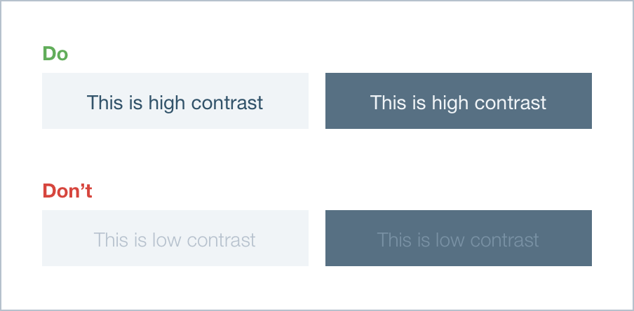
- Default font should be reasonably large. Avoid small and thin fonts, as they make reading harder. If you must use a small font, increase the contrast by making them thicker or picking the best color based on the background and elements around it.
- Use high contrast colors for fonts, especially for smaller size texts. If a background is light, use dark color for the text and vice versa. Avoid using noisy or textured backgrounds behind the texts - instead use plain solid backgrounds.
- Choose the optimal line height (leading). Default size text paragraphs that contain multiple lines of text, should have a line height that allows readers to easily distinguish lines from each other while still being identifiable as a single paragraph. For default reading text the optimal leading ratio is around 1.2x of the font size.
- Avoid particularly long and short line lengths. Improper line length makes the content harder to understand, and therefore remember, because it requires extra energy to read. A good baseline average for a text column is approx. 10 words per line or 70 characters.
- Avoid center text alignment for columns longer than 1-3 lines. Align long paragraphs to the left side in left-to-right languages.
- Pay attention to spacing and grouping. Put the titles closer to related paragraphs and texts to related content (e.g., images). Unrelated content should keep more distance from each other. Add reasonable margins between text and "noisy" content.

- Use simple words - the shorter the better. Avoid complex terms and jargon.
- Use short sentences. Avoid long, complex and compound sentences. Complex clauses in the middle of a sentence makes it harder to understand and remember.
- Keep titles short. If extra information is needed, add a subtitle. Put long sentences in a paragraph.
- Make CTA titles short and clear. Long button titles take longer to understand and negatively affect instant action.
Colors
Colors should help the user to navigate and easily understand elements actions.
- The product should have a distinctive color palette - pick a specific group of colors and use them consistently.
- Use colors in clear patterns - use specific colors for elements (or their groups) that do similar actions. For example: main and secondary buttons can have the different hues of the same color for their backgrounds; hover states can be the same color within certain element groups (lists, buttons, cards).
- Pay attention to the contrast between the colors you use. It’s important to have high contrast between colors to increase usability and readability (e.g.: button & text, background & text, button & background). Color contrast also influences the hierarchy of elements - high contrast brings more attention to objects and makes them primary.
- Colors should be chosen with context in mind. Once you've decided to use a color for a specific action, don’t use the same color for the opposite action - e.g., don’t use warning colors for success messages, clickable elements for disabled ones and vice versa.
- Be extra careful when using the color grey in your product, as it can be understood as a disabled action color. For example: a button with grey text and background looks disabled, but having a button with grey background, orange borders and text looks enabled.
Icons and Illustrations
Icons and illustrations are not only visual additions, they help users to identify actions and meaning of elements.
- Icons and illustration should follow one visual style throughout the product.
- Make sure that icons and illustrations convey their purpose clearly and are relevant for the situation they are used in.
- Icons for actions should be used in addition to text explanations (written nearby or appearing on hover).
Element States
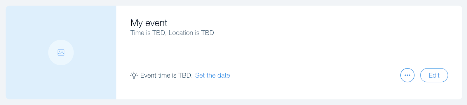
- Empty state (placeholder): If an element is empty or has no pre-entered value, use a placeholder to indicate what should be done (e.g., text input placeholder) or visually represent that the element's value is empty (e.g., image placeholder).

- Default state: A state in which component is active and ready for action.
- Hover state: If an element is interactive in some way, it should display a hover state. Hover state is visually different from the default state and appears when the user hovers their mouse over an element.

- Focus: There are two types of focused states.
- Input fields: As a user types into a field, mark the borders to appear active.
- Active elements: As a user navigates through a page using keyboard buttons, highlight clickable and active elements as they are selected. This can look the same as the input field focus state.
- Input fields: As a user types into a field, mark the borders to appear active.
- Selected: When a specific element is selected out of a group, visually change its state after the action.
- On/Off States: Primarily used for toggle elements.

- Disabled States: Disabled states should be visually distinctive from other states and should restrict the user from using the element. (If you need a disabled state, make sure to explain to the user why the element is disabled.)

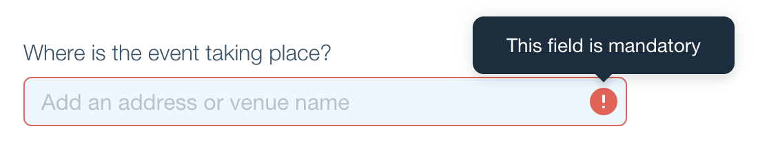
- Error States: If a desired action can’t be completed due to some error, this should be clearly represented with warning colors and messages that provide an explanation of what went wrong.
Demo data
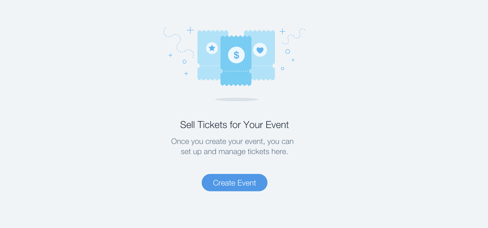
- For larger areas with no data (no stats on the site yet, hasn't filled in their site info yet, etc.), include an empty state with a Call To Action. If the user has nothing to do here, display demo data (not Lorem Ipsum).
- When using demo data in input fields, we recommend two options:
- Display placeholder data that explains to users what they should enter.
- Display real content that appears in the widget, and allow users to override it. This allows you to display real content in all the input fields.
Messages: Success, Error, Warning, Confirmation
- You can display messages as:
- Pop ups or notifications: Use these sparingly, only for actions that need confirmation, e.g., deleting important information, missing info for registration, etc.
- Icons with text or tooltips: Use these when information should be shown but is not critical enough to display over the entire screen, e.g., character limit on text input.
- Small banners: Use these as confirmation messages, such as “your changes were saved”. We recommend displaying these types of messages, as they gain your users’ trust.
Onboarding & Setup Wizards
- The user should always see their progress through a wizard. You can display their progress as a list or diagram of steps, with the current step highlighted.

- Allow users to navigate between steps. Each step should have clearly indicated ‘next’ and ‘previous’ buttons.
- Each step should be self-sufficient, and should not require information from anywhere else in the app or in any other step of the wizard.
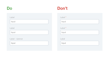
- Limit the number of optional fields and indicate next to a label that they are optional.
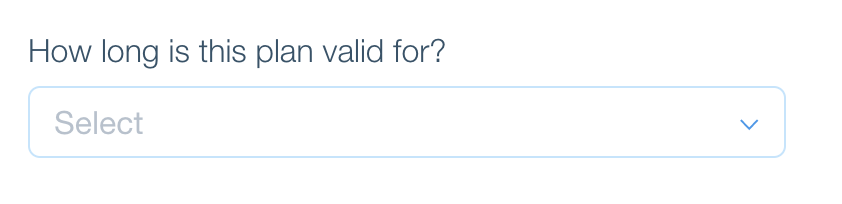
Input Fields and Forms
- Group visually related elements together. Place labels close to the fields they describe.
- Align fields in a single column layout. Avoid multiple columns, except for short and logically related fields (e.g., city and ZIP code).
- Match fields to the input type and size (e.g., paragraph vs. one line).
- Display a character count (e.g., 15/200) next to the label.
- Make sure your fields have all the element states they need (hover, focus, error, confirmation).
- Distinguish between optional and required fields. If there is a larger number of mandatory fields, then only highlight the optional ones, and vise versa.
Requirements for Internal Dashboard Apps
If you have your own dashboard/platform/site, use that design for your internal Wix dashboard and don't try to adopt Wix design. We are flexible with the design you choose; however, be consistent with your own design throughout your product.
- Make sure the app design is yours: Do not copy the design of another app in the App Market.
- Keep the maximum width in mind: Your app should use the full screen, with a width up to 1200px.
- App height is based on its content: The browser adds scroll bars when needed. Don’t add your own scroll bars.
- Do users need to upload media files?: Open the Wix Media Manager so that users can choose a media file they already uploaded to Wix servers (image, document, audio, or SWF).
Note: Use the Wix.Dashboard.openMediaDialog SDK method. - Use the Wix modal to open a window or dialog box: It’s a lightbox-style window that opens over the Wix dashboard. Users can close it by clicking the close button or anywhere outside of the lightbox, and you can close it within the app.
Note: Open the Wix modal using the Wix.Dashboard.openModal SDK method. - The max modal height is 650px: Don’t exceed this size for your modal.
- Mark premium features: Add an icon next to premium features. When users hover over the icon, you can show a tooltip with more information about the feature, and an upgrade link that opens your app’s billing page.
- Make it easy for users to upgrade: Add an upgrade button that opens your app’s billing page.
Was this article helpful?
